How to Evaluate a Pitcher with the MLB Tableau Dashboard
I show my process for evaluating pitchers with the main MLB Tableau dashboard.
I’ve gotten some questions lately about how to evaluate pitchers. Specifically, a few different people have asked what stats to look at if we can only pick a handful.
I do have a direct answer to that question:
xFIP, K-BB%, SwStr%
But I think it’s a good idea to take this to the next level and give a full picture of how I analyze pitchers.
This also functions nicely as another tutorial for how to use some of the tools you get access to as a subscriber here. There’s so much stuff you can do with the dashboards I’ve developed, but the problem is that they’re not all that self-explanatory. I’ve made some tutorial videos - but the more, the better.
So let’s take an example and go through analyzing a pitcher with the dashboards - I think a lot of people will find this beneficial.
We’re going to use Hunter Brown, because I think he’s still a somewhat unknown commodity since he’s officially a rookie, but we have enough data on him to dive into it.
Step 1: Main Pitchers Tab
I go to the Pitchers tab and then find Brown.
This view gives you a bunch of stats, and it tells you a lot about the guy.
Seeing a 47.5% Strike% doesn’t do you much good if you don’t know what is good or bad in that stat, so a tip for that:
the league averages will display in that “Grand Total” row when you don’t have any other filter applied.
In that screenshot above, you see the Grand Total row just matches Brown’s stats. That’s because it’s taking the averages from only what is displayed below. And since we only selected Brown, that’s all the data we have to use.
So refresh or just take the Hunter Brown filter off and you’ll see the actual league averages:
So comparing Brown the league averages, we find:
His SwStr% is a point below the league average
His K% is 3.5 points above the league average
His BB% is 0.8 points below the league average
His GB% is is 10 points above the league average
And so on, and so forth.
Those are the key ones I want to look at though Brl% and xwOBA are subject to a lot of noise, so I never want to get too bogged down by those marks. If a guy has a very low or very high Brl%/xwOBA, you should expect some natural regression toward the mean - those stats aren’t ones that a pitcher can control nearly as much as they can control the numbers I mentioned in the bullet points above.
Brown’s Brl% is high at 9.5%, which is significantly above the league average, and it’s even more surprising given the 53% GB% (a ground ball cannot be a barrel, so these two stats are related to some degree), so you could predict that the Brl% will come down in the future - which would be a good thing in the evaluation of Brown.
Data relationships are a good thing to understand, and I talked a lot about those in this post - so check that out.
But one that stands out here for Brown is the lower SwStr% with the higher K%. We can then flip over to the “SwStr% vs. K%” tab on the main dashboard to visualize that.
If you’re more statistically minded, you can hover over the trend line and see this:
This R-Squared value tells you what percentage of the variation in K% is explained by SwStr%. The closer that number is to one, the more these values are related to and predictive of each other. A 0.69 mark there shows a real relationship there, as does the fact that the dots are all pretty close to that trend line.
So for Brown, this is a sign that his 26.3% K% might be a bit bloated due to good luck.
If we go back to the main pitchers dashboard and filter down to pitchers with at least 10 starts and a SwStr% between 10.8% and 11.8% (0.5 points in either direction), we see this:
Applying those filters gives us the list of SPs with 10+ starts and a SwStr% in that range. The Grand Total column then updates with the averages using just those pitchers, and we see a 21.5% K% as the average.
If we sort by that K% column, we see that Hunter Brown has the highest K% of any pitcher with a SwStr% between 10.8% and 11.8%.
There are explanations for this other than random luck
Maybe he locates extremely well
Maybe he’s very deceptive and tunnels his pitches very well - freezing hitters more often than not
If those two are playing a part here, then we could expect him to out-perform his SwStr% moving forward, since in theory, those things shouldn’t change.
We do know with Brown that he’s had a reliably low walk rate. That tells us that he has good command, so it’s more likely that he’s really just dotting pitches on the edges to get more called strikes than other pitchers.
But that’s a lot of speculation there, and while some of it might be true - the smart money is still on his K% gravitating down toward that 22% mark you see as the average for this group of pitchers.
Step 2: Pitch Arsenals Tab
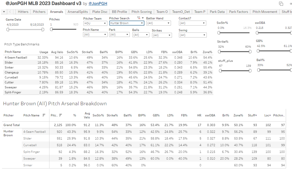
I spend more time here than any other tab when looking at an individual pitcher.
What’s nice here is that you get the “benchmarks” table at the top so you can easily compare each pitch type with the league average on that pitch type. This is very important to do, because, to take an example, you shouldn’t expect the SwStr% marks on a sinker and a slider.
You want to compare each pitch type with the league averages rather than the pitcher’s other pitches.
That’s a big picture of the tab, but let’s zoom in on just Brown’s pitch mix:
It’s pretty wide, so let’s cut it down a bit further:
I like to see the Stuff+, but I’m mostly focused in on these columns.
You don’t absolutely need a deep arsenal to have success, as evidenced by Spencer Strider, but more pitches are, at least in general terms, better than fewer. But two really good pitches is better than six bad ones. There’s no general rule to follow about arsenal depth.
First, we look at the four-seamer. It has a 9.5% SwStr%, which is below the league average of 10.6%. Despite that, it has a 54% Strike%, which is five points (a huge difference for this stat) above the league average of 49%. This means that Brown is getting a ton of called strikes with this pitch. That could be a sign of good luck and it can be a sign of good command. I’m guessing it’s a bit of both, but it certainly bodes very well for Brown just having very good control of this pitch. And it’s incredibly important for a pitcher to have good command of their primary fastball. Most barrels, and therefore most homers, are given up on four-seamers. They are much easier to hit hard, so it’s really important to keep that pitch away from where hitters like it - and Brown has done that with a 9.7% Brl% which is below the league 10.6% on four-seamers.
The rest of his arsenal is mostly sliders and curveballs. The slider at 10.3% is very low (16.3% league average), and the curveball is a bit above the average (14.7% for Brown vs. 13.3% for the league).
There is a lot more to potentially look at here, but I won’t get into much more for the sake of time. But one thing that does stand out is the GB%. He has higher than average GB% on each of his three main pitches, which to me means this guy is going to continue to post high GB% - which we like to see.
But overall, it doesn’t seem like he has a great arsenal for generating a high strikeout rate, which makes me even more wary of the 26% K% he currently sports.
Another note here is that you can see stats on contact or on swings by selecting “1” in these dropdowns:
I selected “1” on the Swing dropdown and the stats update to this:
The Ball% goes to zero because you can’t get a ball if you swing! The main use for this would be to turn the “SwStr%” column into “Whiff%”. You’ll see other people citing “whiff rates” instead of “swinging strike rate”, and the difference there is that whiff rates are whiffs / swings instead of whiffs / pitches.
So you can get that data in this way, but the column name isn’t going to change and you won’t find “Whiff%” written anywhere on the dashboard at the current moment.
Arsenals Splits
I don’t do this a lot, but if you’re really digging into a pitcher - it’s good to know this stuff. This is just the pitch mix data broken down by batter handedness.
You will often see, for example, sliders go toward 0% when facing the opposite handedness. That’s not the case with Brown, but you do see the usage drop to 21% when facing lefties.
The only thing I’m usually checking this for is to see if a guy is really good or really bad against a certain batter hand. I don’t want to take it too seriously, however, because splits are pretty noisy. It takes a really long time to get sufficient data samples on this, and you usually don’t have it in a single season - so you have to be pretty careful here.
But if a guy has different ways to attack both sides of the plate, that can certainly help out - I think of Shane Bieber’s 2022 season a lot with that. He didn’t have great stuff to use, but he was able to get lefties and righties out in different ways. Again, I don’t use this tab very much - but it’s there.
There’s also a tab that gives you the hitter stats against each pitcher broken down by handedness (it’s called P Splits), that’s a good thing to check as well in conjunction with how they change their approach against each side of the plate:
Step 3: P Usage Tab
This is a quick and easy way to see if a pitcher is changing his approach through the year. It shows you the pitch mix usage by start in line plot form, a very useful plot:
We see with Brown here that he started with more sliders and curveballs and fewer four-seamers, but since May or so he’s been throwing the four-seamer as his primary pitch.
In most cases, you won’t see many significant changes along the way, but there are cases where guys just completely re-tool themselves mid-season, and that’s a very important thing to notice.
If a guy scraps his main pitch, he’s basically a new pitcher - and you need to re-evaluate him after that change. So check that tab at least briefly if you’re breaking somebody down.
Step 4: Pitcher xStats
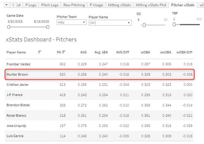
There’s not much data in this tab, but it’s a good thing to check. It will show you the batting average allowed vs. the expected, and the same for wOBA.
In Brown’s case, he has a much lower expected wOBA than his actual - so another sign of potential good fortune here.
So that’s basically how I evaluate a guy. I spend most of my time in the main Pitchers tab and the Arsenals tab, but there are several more tabs available to find more information - I’ve talked about them below, but feel free to stop reading now - I’ve said the main stuff I wanted to say.
Other Tabs
Pitch Movement Tab
I don’t use this one very much, because pitch movement stuff just doesn’t interest me as much as it does other people, but the data is here.
And I include the “League Averages” again so you can compare each pitch with the league average.
Here we see that Brown has a lot of vertical movement on his curveball, five inches more than the league average. And you could go through the other pitches too and see more, but I’m not going to spend more time here. This is most useful for pitchers that have just come up and only made an appearance or two. In that case, we won’t be able to trust the other metrics because of the small sample sizes - but we’ll be able to know what kind of movement they have right away, so you could use that to compare to other pitchers and maybe learn something more quickly in that manner.
But overall I don’t think movement is all that important to look at, because it’s not very useful if you don’t have good command of the pitch.
Pitch Scoring Tab
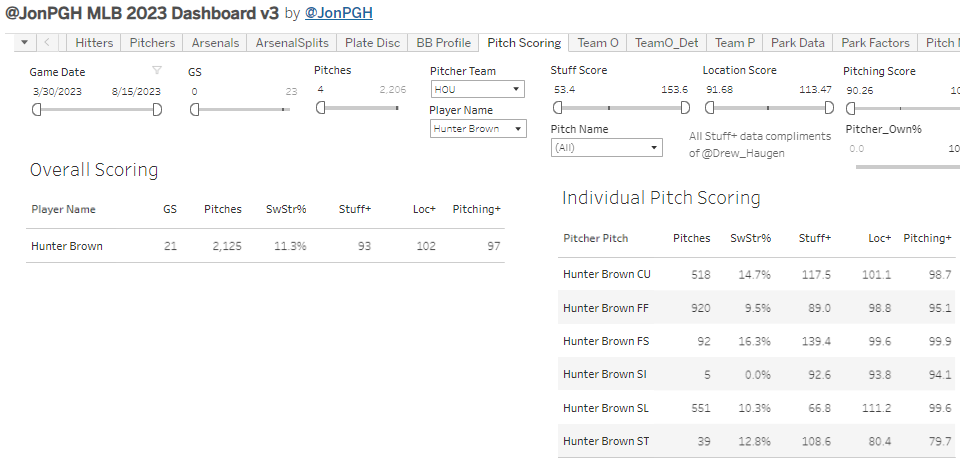
This is the tab with the Stuff+, Location+, and Pitching+ data that comes from my guy Drew Haugen.
The one thing to note here is that, unlike everything else on this dashboard, the data isn’t updated daily. Drew has to run that stuff himself and then send me the file - and he’s unable to do it every day so we just try to get an update every week or two in there.
I don’t want to get into the details here, but you can read a ton about these pitch models elsewhere. But super quickly, the average on all of these is 100, so the higher above 100 - the better, and vice versa. With Brown, the Stuff+ 7% lower than average, but his locations have been good.
Stuff+ is very predictive of future Stuff+, but that’s not the case with Location+ and Pitching+, so you have to take this all with a grain of salt. You can have great stuff and be bad, but it’s pretty tough to be great with bad Stuff+.
Game Logs
We have a few different tabs for breaking down the data at a start-level.
First is “P Logs”, which shows you this:
This is good to just see how a guy did in an individual start, I do that a lot in the daily notes. It can also help you see trends. If a guy adds a pitch in the middle of the season and has a higher SwStr% afterward or something - this can help you spot that. It’s also possible to just adjust the date ranges in the main tabs as well, so you don’t really need this tab to see monthly splits or things like that.
There’s also a pitch logs tab that shows you data on each individual pitch type by start. I’m not going to show it, because I have to wrap this up - but it’s there and all pretty clear when you’re looking at it.
The best way to learn more is just to click around in the dashboard, and send questions my way any time. The best way to do that is with a Twitter DM or a comment here.


It’s become my new favorite time killing hobby to click around on the dashboard until I come up with something to tell my fantasy baseball group chat😂 my favorite one recently is corbin carroll hitting .211 since June 24. Kinda crazy
Hey these articles are great can you do one for hitters as well?